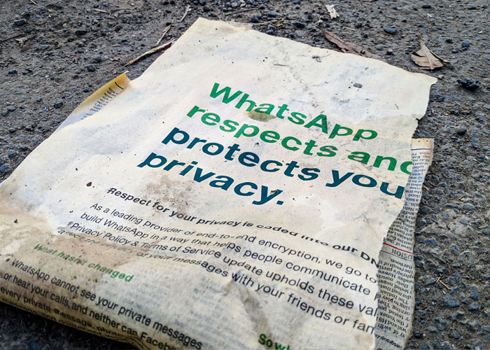
Typography delivers the message.
In face-to-face communication, feedback is instant, and the experience is interactive, which makes it the most advanced and effective method of communication. With text, there’s no two-way feedback, and we’re left only with symbols and letters – a visual representation of language. In this simple way of communication, typography and content need to work together to form our impression and emotion. By manipulating different properties in typography we can affect how it delivers a given message.
Elegant type is always a compromise between form and function. The good form improves visual impression and aesthetic quality. Heading and other shorter texts whose goal is to make a statement should rely on the beautiful form. Function comes in handy for smaller type sizes used for running text whose goal is to be read. The most important role of headings and display type is to grab the reader’s or user’s attention to the content. When users or readers dig in the content, the role of type is to be legible, readable, and overall functional. By respecting this delicate relationship between form and function we can communicate and deliver the wanted message in the way we desire.
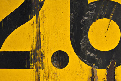
We should think of a text as a complex and dynamic shape that creates tension and builds contrast with the surrounding elements and background. Depending on how we want to present information, we can decrease or increase contrast to control how it affects the final tone of voice. Creating contrast helps us build a hierarchy between different typographic elements, which lets us control the message we deliver to the end-user. We can manipulate four different properties of type to create contrast – size, color, shape, and placement of typographic elements.
The presentation itself can be a deciding factor in how we interpret the content. The message becomes more interesting if shown appropriately. Just like in the real world, a lot of different factors can influence how we interpret certain information. In a world of typography and design, we can manipulate the type’s dimensions, weight, width, height, and other properties.
In that matter, some typefaces are more formal, while some are playful and almost childlike. More organic shapes usually make non-formal fonts and straight lines with delicately made curves make for elegant formal ones.